Atmossphere.
Subway beautification and air quality enhancement
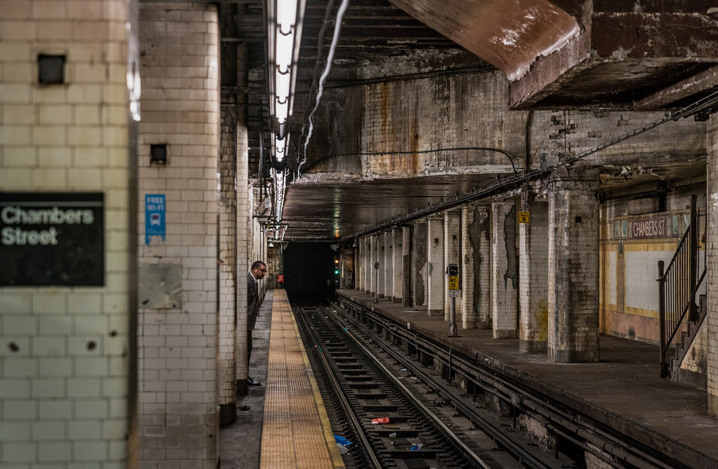
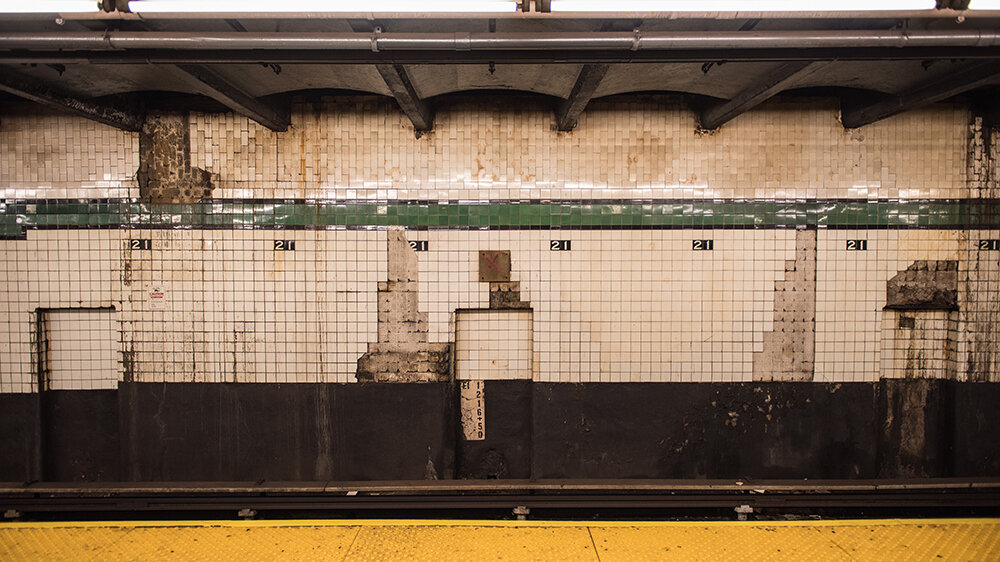
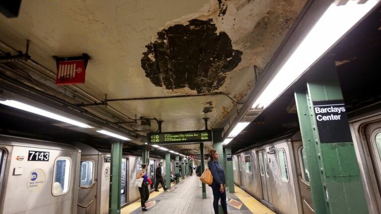
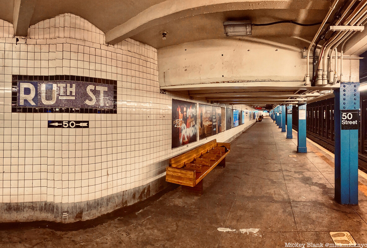
New York subway stations suffer from serious aesthetic downfalls and a lack of air quality…
What is something that can be done to fix this and improve the overall NYC transportation experience?

Role
For this school project based in a Human-Centered Design class, I joined three other students on a design team that jointly conducted UX research and prototyped a mockup solution.
Duration
~2 months (March-April 2021)
Overview
In a project that forced me to think outside of my comfort zone of designing user interfaces, I was instead challenged to place heavy emphasis on in-depth user research in a short amount of time.
Beginning with the simple prompt of, “Improve the experience for users of public transportation in New York City”, my team decided to embrace the creativity behind environmental engineering and design a solution that could tackle multiple issues present in the NYC subway system; notably, it’s sub-par aesthetics and poor air quality.
Team
Zachariah Gharrafi
Rohan Sahu
Jesse Cohen
Tools
Figma, Photoshop
Scope
User Research, Prototyping
Location
Louisville, KY (Remote)
First Steps
“Improve the experience for users and others that engage with transportation in the City of New York.”
With only this prompt to begin with, our team of four was left to creatively ponder the statement and begin the process of addressing the needs of New Yorkers in order to revamp or refresh the city’s transportation systems.
After virtual introductions and familiarizing ourselves with our strengths and weaknesses, we began brainstorming starting points upon which we could build something to address this challenge.
Narrowing the Scope
When thinking of the primary user of whatever our solution would be, it was clear that it would lean most heavily towards daily commuters and those reliant on New York’s many public transportation systems.
Beginning here, we defined our ideal opportunity area as the MTA subway system. While the class did not define any limits pertaining to budget, feasibility, or scale, we agreed that we wanted to develop something that we could actually see succeeding should we pursue the project further.
To give our timeline some sense of initial visibility, we operated off of the proposed Gantt chart pictured below.



Pain Points
We opted to gather both quantitative and qualitative data from daily users of the subway through two mediums:
First
We organized a list of open-ended questions designed to bring out stories from our users in an effort to get a deeper understanding of the general pain points associated with travel on the subway. As a remote project, our two NYC-based team members carried out ten separate ethnographic interviews with various New Yorkers travelling through two different stations on separate lines in the subway.
From these interviews, the data revealed three general pain points associated with the subway transportation experience:
Second
We conducted an online survey linked to QR codes that were then posted in major subway junctions throughout New York City, including Times Square, Grand Central Terminal, and notable express stops on these lines. Overall, we had 241 responses to this survey.
These insights gave greater weight to our interviews, as the lowest rated factors attributed to the subway experience included air quality and the condition of the stations, with service outages coming in third.
Validating the Concept
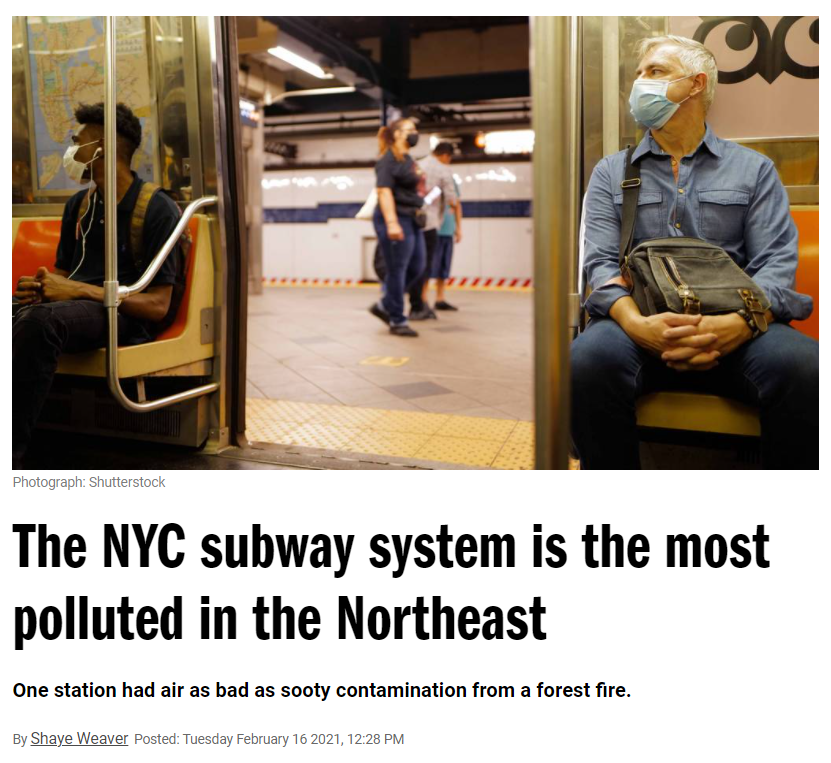
According to the Gothamist, New York has nearly double the amount of air pollution than in the subway systems of other cities. Articles are abundant that cite airborne particulates in shocking densities. Both the PATH and MTA stations find their particle counts between 251-392 micrograms per cubic meter (outdoor air averages at just about 16).
The 2018 MTA Satisfaction Survey reported that about 62% of all subway riders were generally unsatisfied with the services, and 40% were specifically unsatisfied with the condition of MTA subway walls, ceilings, and cleanliness.
Our Solution
We began reflecting on these pain points more closely in a group discussion. After brainstorming methods that could tackle both the issues of aesthetics and air quality jointly, Zachariah offered his knowledge as an environmental engineer through the idea of Biophilic Phytoremediation.
11 syllables, three tries at pronouncing it, and two $10 words, but easily summed up through one simple idea; “Plant Art”.
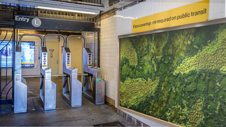
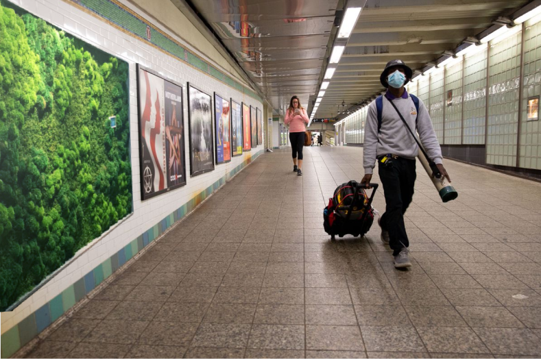
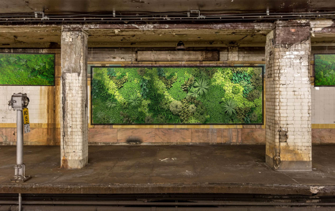
Basically, through green remediation of our living areas and bringing the natural world into our spaces, we are able to both cleanse the air and beautify these places simultaneously. After analyzing the Biophilia Hypothesis, the NASA Clean Air Study, and success of real-world examples, we were impressed by the ability of both moss and lichen to remove airborne particulate matter from their respective environments.
Adding plants to the subway is also supported by research stating that cleaning areas and greenifying them leads to people feeling happier and having reduced symptoms of depression. These notes completed our pain point trifecta by addressing how we would improve the lighting and mood for MTA users.
With a heading now established, we were able to finally define our opportunity area more specifically:
“There is an opportunity to enhance the MTA transportation experience, encourage environmental sustainability, and apply a daring new aesthetic to subway stations as we know them.”
Drawing Inspiration
This idea led us to look into a number of projects, ideas, and locations that also developed this concept and took measures to create either working or theoretical solutions.
Notably, we identified:
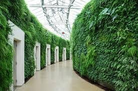
Longwood Gardens, Pennsylvania
Changi International Airport, Singapore
The High Line, New York City
San Francisco Transbay Transit Center, California (Proposed)
Hudson Yards Subway Entrance, New York City
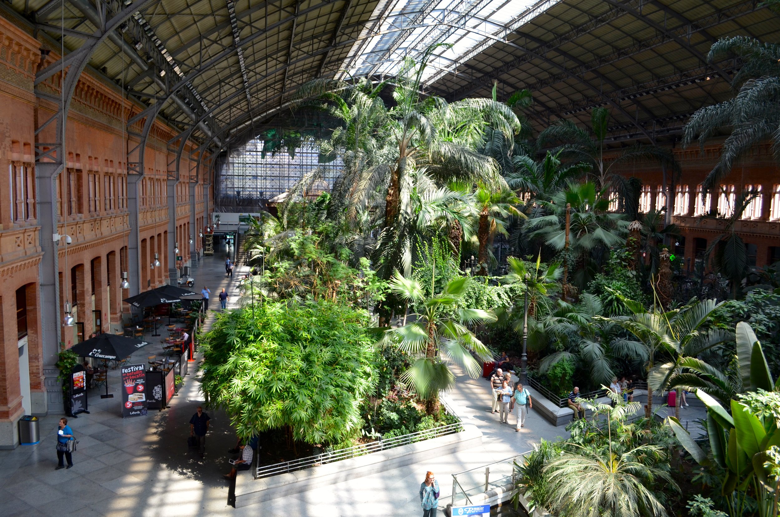
Atocha Rail Station, Madrid, Spain
Using these visuals, we got a bit more familiar with what to expect, as well as being able to identify positive and negative feedback to augment our research from sources that have already been published about the above solutions.
Directional Ideation
After going over the research and discussing different ways of putting into action the notion of plant-based art, we had to decide on design concepts that would be manageable and durable against the rigors of daily travel in the MTA. To remain as user-centric as possible, we continued our interview process for users to assess what their experience might be when possibly interacting with these prototypes.
We revisited some contact information given by consenting participants; Rohan and Jesse followed up with 10 more individual qualitative interviews and specifically focused on evaluation of each prototype individually, as a group, and against the current status quo.
We created lo-fi prototypes of each of the following solutions and looked for user sentiment, reception, and overall support toward these specific ideas, as well as remaining open to other offerings or suggestions by the users.
Our three ideations included these possibilities:
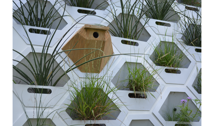
Honeycomb/Wall Structures
User Responses:
"Too much structure, not enough plants"
"I don't think this look goes with the subway"
"This doesn't look like it would make much difference"
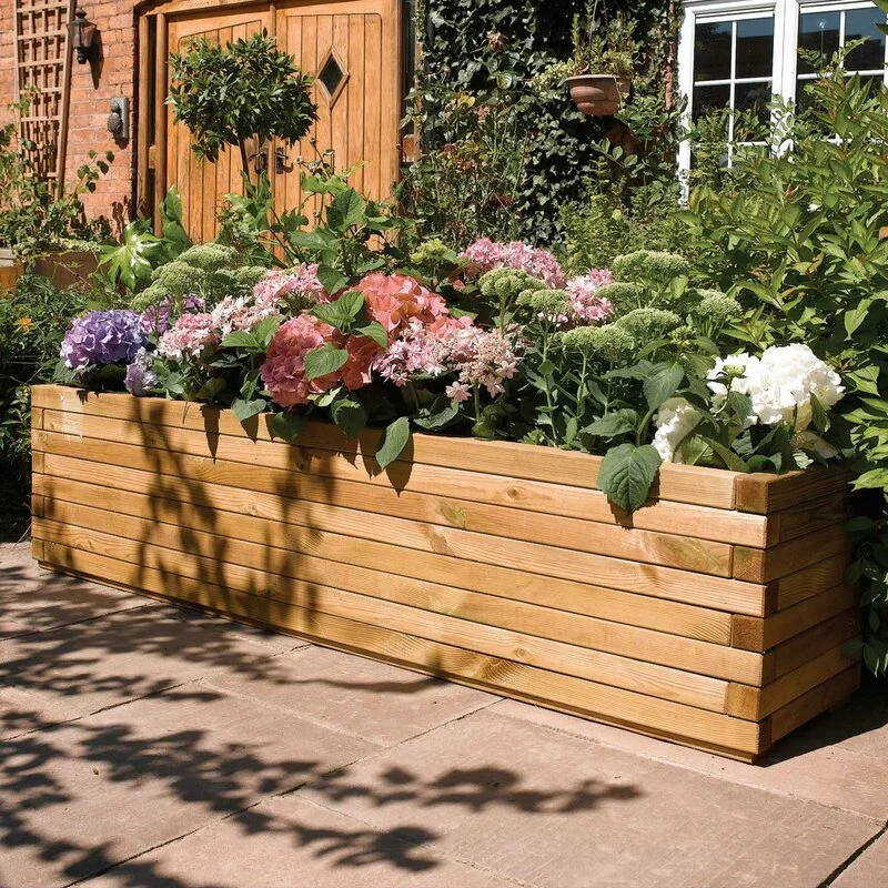
Flower Pots/Grow Boxes
User Responses:
"These seem like they would get messed up very quickly"
"There's barely enough room when it's packed in the subway as it is, I wouldn't want to move around these"
"They're beautiful, but I can already see them getting ruined fast"
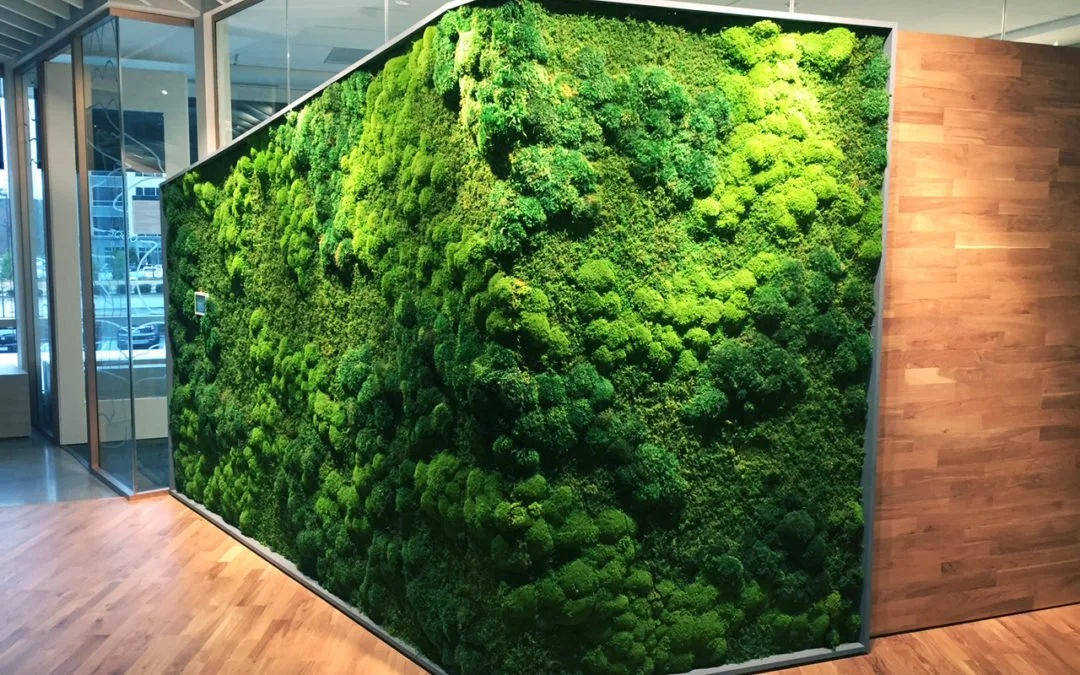
Green Walls
User Responses:
"This looks super fun and very original...like nowhere else in New York City"
"This is like having art and a garden together, I feel better already"
"If this could be properly maintained I would love to see these in the MTA"
In each of these interviews, we noticed measurable critiques for grow boxes and wall structures, but resounding support for the green wall. Using this data, we evaluated different build styles, plants, sizes, and ultimately how well all these variables worked together.
Considerations when choosing were:
Effectiveness of the plant’s air filtration/purification
Maintenance needs/cost
Durability
Space required
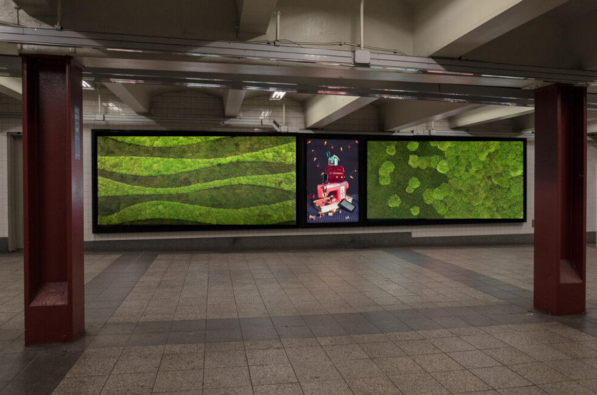
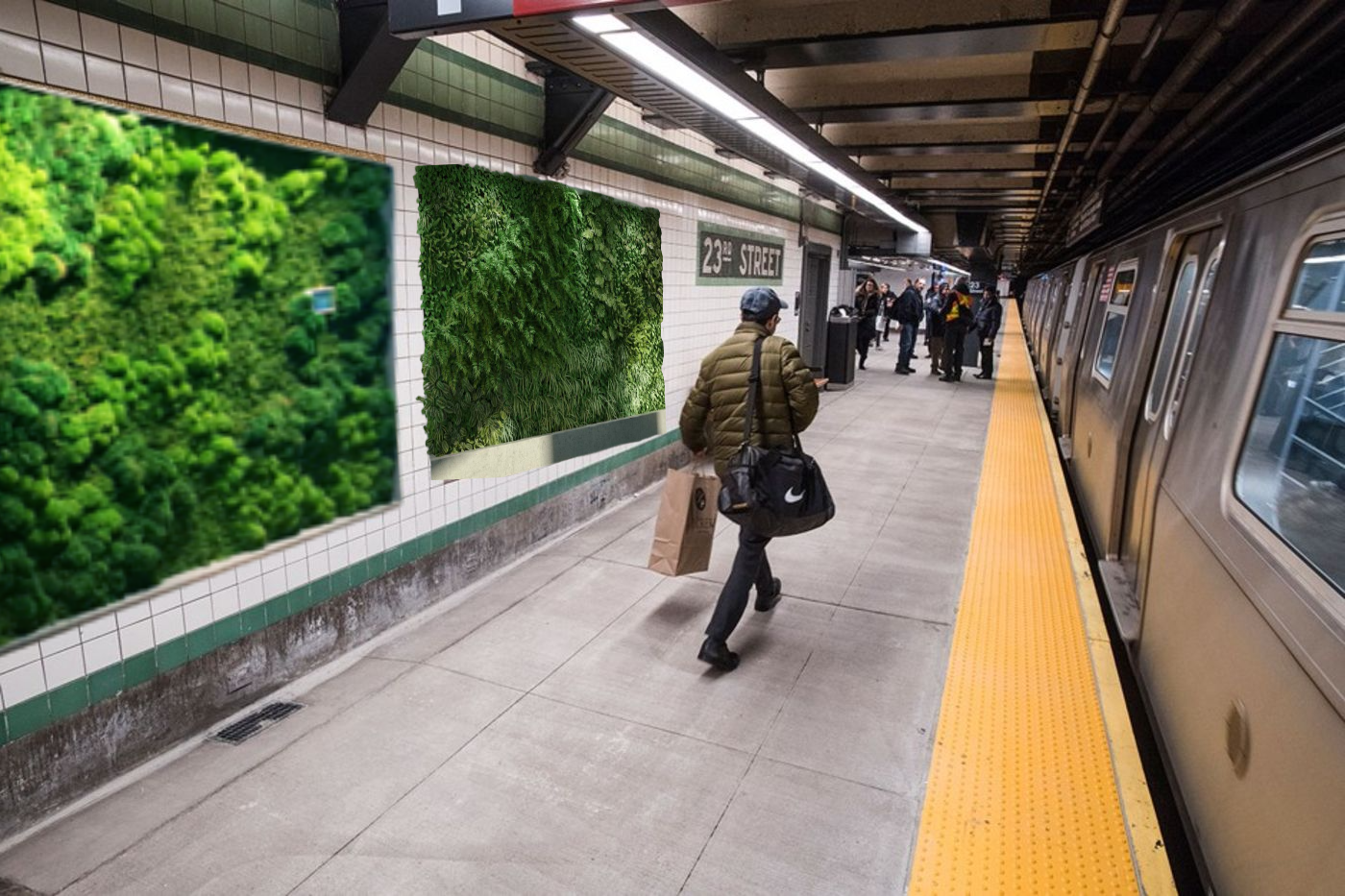
After consulting the NASA study we mentioned earlier, as well as looking at what designs could be feasible in pursuing altogether, we arrived at our final solution; implementing a green wall consisting entirely of moss.
Why moss?
High impact air filtration
Moss has a much larger leaf surface area than any other plant, making it capable of capturing a larger quantity and wider array of airborne pollutants including those prevalent in NYC subways (PM 2.5)
Beautification for Psychological & Physiological benefits
“Green space can provide mental health benefits and possibly lower risk of psychiatric disorders. This nation-wide study covering >900,000 people shows that children who grew up with the lowest levels of green space had up to 55% higher risk of developing a psychiatric disorder independent from effects of other known risk factors.”
Study can be found here.
Noise reduction
In lab tests, researchers found that a modular green wall system reduced sound levels by 15 decibels (dB).
Natural temperature regulation
Green walls reduce the ‘urban heat island’ effect, reducing temperatures by upwards of 10oC (50of).
Ease of upkeep and care
Moss receives all of its nutrients from the air while most other plants utilize their roots, meaning it only requires regular misting to be kept alive and healthy as opposed to a nutrient infused water system.
We further considered ways to iterate through our prototypes and present a design solution to our users. In doing so we entertained a number of thoughts:
What is the range for the application for this solution?
How does this influence our customer’s journey?
How can we maximize customer satisfaction?
Does this solve our pain points?
In addressing these repeatedly as we iterated prototypes, we internally critiqued our design process and built our solution in a way that is user-centric, cooperative with its ecosystem, and directly addressing our problem in an innovative and unique way, thus leading us into our mockups.
Hi-Fidelity Prototypes:
Nearing the end of the course, we took these ideas and created a way to express their value to the public in our final assignment; the promotional video below.
After Action Review (AAR)
Design Sprint
This final project came near the end of our course and with an expedited timeline, so there are points that we think we moved a little faster than we had liked to. We met frequently with our professor to check progress and receive feedback, but guidance was intentionally limited so that we could take the instruction given in class and interpret it in our own way.
Virtually Challenged
With college it’s implied that this isn’t the only course we had on our plates. Throw into the mix that our team members were located in different time zones with varying workloads and coordination becomes that much harder to coordinate. Slack proved really useful as an organizational and messaging platform, but getting together for meetings, updates and other events was often pretty hard.
Put it All on Paper
As things became a little more hectic in the end, it would have paid off to have spent more time planning the project, it’s milestones, the roles, and other little details at the beginning. While the Gantt chart served as a general calendar, pivots, extensions, and other circumstances changed our course in a way that we didn’t really anticipate.

